_edited_edited.jpg)
About InterMed
InterMed provides tailored solutions that help hospitals and clinics manage and maintain essential medical equipment. Their services range from strategic equipment planning and maintenance to providing support for in-house teams. This holistic approach enables healthcare providers to have the tools they need to deliver great patient care. The company works closely with teams to solve problems, save money, and make equipment easier to manage.
Soft Rebranding InterMed
Humanizing Healthcare Technology
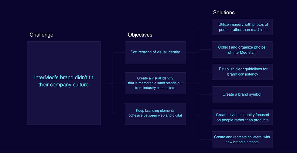
Even though InterMed provides essential services that directly impact patient care, its brand didn’t fully reflect its people-first approach. The company faced challenges with a cold, impersonal brand image and a lack of cohesive materials, making it harder to stand out against larger competitors. When leadership embraced a stronger people-first focus, it created an opportunity to refresh the brand’s imagery—aligning it with the heart of the company.
My Role
-
Create a new brand symbol
-
Adjust InterMed's visual identity to match more closely with company values
-
Create brand guidelines
-
(Re)create brand collateral using new visual identity
.jpg)

01
Discovery
When I started working with InterMed, I wanted to truly understand the company—not just its services, but its identity at the core. The brand had all the right words about being people-first, prioritizing both employees and partners, yet visually, it leaned heavily on machines and equipment. The warmth, the human connection that leadership spoke so passionately about, wasn’t showing through.
I sat with that tension. I needed to know what was missing...
Through leadership discussions, company-wide meetings, and direct conversations with the CEO, I kept pressing in. I studied the visuals, the language, the way InterMed showed up to the world. And the deeper I dug, the more I saw the gap. Until it clicked:
InterMed wasn’t about medical equipment—it was about people.
That was the driving force behind everything.
The engineers ensuring every device ran flawlessly. The hospital staff depending on that reliability. The patients whose care hinged on every perfectly calibrated piece of equipment. That was the heart of InterMed.
While a full rebrand wasn’t the on the table since leadership wanted to keep core elements like the logo and colors, I knew we could refine the visual identity to better reflect what InterMed truly stood for.
It wasn’t about changing the brand.
It was about making sure people could see what had been true all along.
With this in mind, here are next steps:
.jpg)
02
Logo Design
With a people-first approach in mind, we needed a logo that was versatile across both print and digital platforms. Rather than simply representing what we do, it had to reflect who InterMed is as a people-first ogranization.
.png)
03
Logo Inspiration
I wanted a logo that wasn’t just a mark but a reflection of InterMed’s values—something that represented they company's values, not just what they do.
As I researched, I kept coming back to logos that seamlessly blend the likeness of a person with a deeper idea—Cigna’s tree-person, Ironman’s humanized “I” and “M.”
That’s when it clicked. InterMed. Two syllables. Two key letters—“I” and “M.” The “I” could represent a person—because InterMed is, at its core, about people. And the “M” could symbolize connection—the way we link patients, healthcare professionals, and technology.
.png)
.jpg)
Logo Variations
_edite.jpg)
04
Brand Redesign
InterMed’s branding lacked alignment with its people-first identity. Dark colors, outdated layouts, and dense text made it feel cold and impersonal. Most noticeably, it lacked human connection—no images of employees, no warmth, nothing that reflected the company’s values.
The messaging also fell short. It listed services but didn’t explain their impact on clients or patients.
Instead of drawing people in, much the collateral felt dense and unapproachable. The design itself added to the issue—cluttered layouts, misaligned elements, and excessive text that became nearly unreadable when printed. It needed a clean, modern look that was both visually appealing and easy to navigate.
The redesign focused on clarity and connection. We streamlined the content, shifting the focus from just what InterMed does to why it matters. The new visuals prioritized people—employees, patients, and the human side of healthcare technology.
Before
After


05
Brand Guidelines
The final stage was the creation of comprehensive brand guidelines, detailing the use of logo, colors, typography, and more, providing a blueprint for InterMed's brand assets and visual identity


